Making the engineering legible
Nearly two years on HDR's visual communication team in Dallas, turning transportation and infrastructure proposals into fact sheets, maps, and renders that engineers, agencies, and the public could read at a glance.
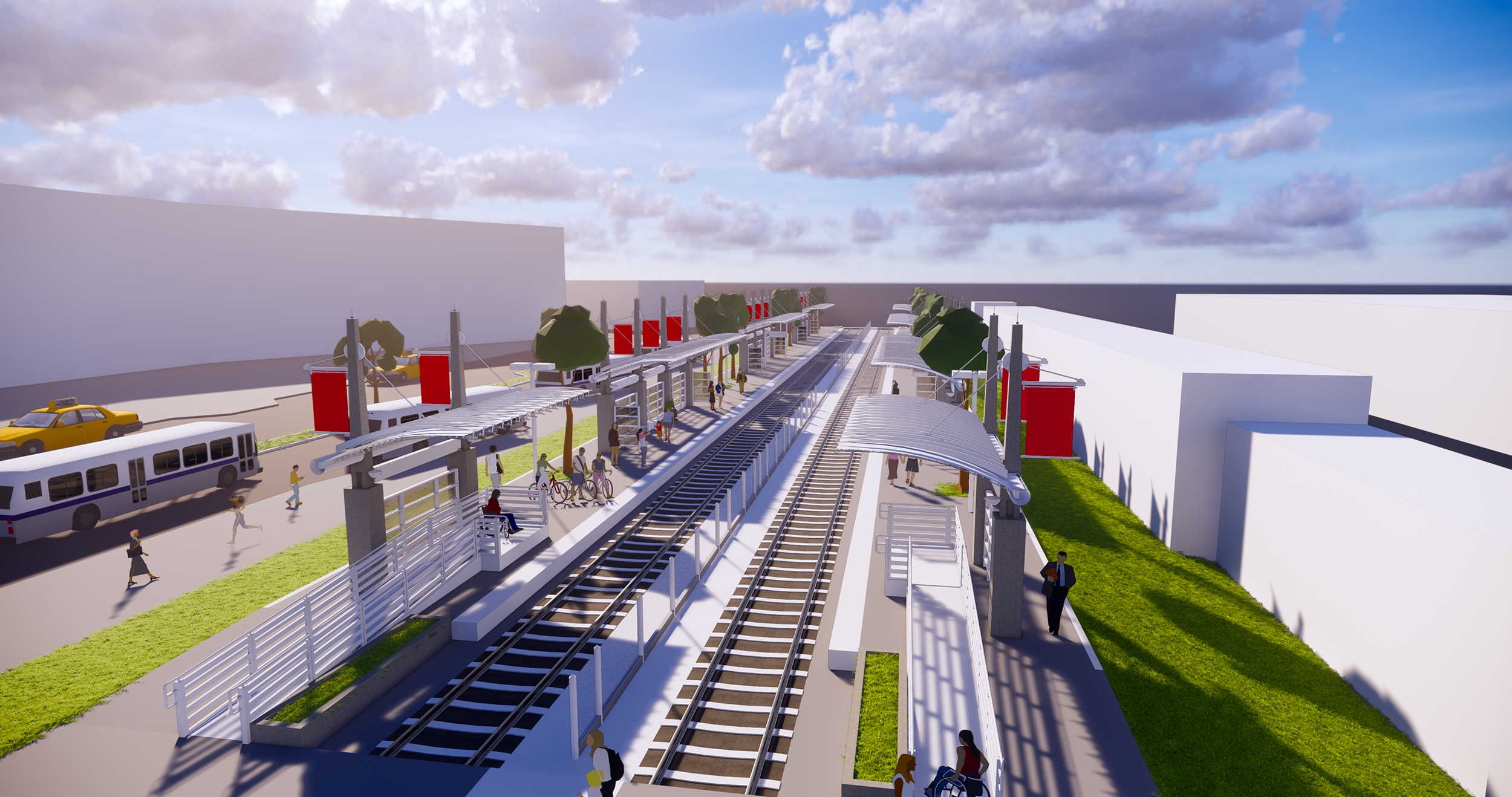
A pursuit is won in a review room, in minutes. The visual that makes the engineering legible is the one the panel remembers.
- Role
- Visual Communication Designer
- For
- HDR pursuit teams; DART, TxDOT, NDOT, ODOT, and other agencies
- Tools
- Illustrator, Photoshop, SketchUp, Blender
- Years
- 2018 to 2019, Dallas office
Why this work mattered
Proposals compete on the page before they compete on the numbers. The visuals carried the argument.
ContextHDR pursues public-sector transportation work: rail corridors, highway reconstructions, streetcar systems, bridges, and water projects. Each pursuit means a proposal, an interview, and a room of reviewers who have to understand a complex scheme quickly. Working with engineers, planners, and marketing specialists, I made the graphics those rooms saw: site-specific maps, infographics, sectional illustrations, and 3D renders that showed the project and made HDR's technical case visible.
The work supported road, bridge, water, and engineering departments and visual communication teams across the company, and went into proposals for DART, TxDOT, NDOT, ODOT, and others. Some of those proposals won multi-million-dollar projects.
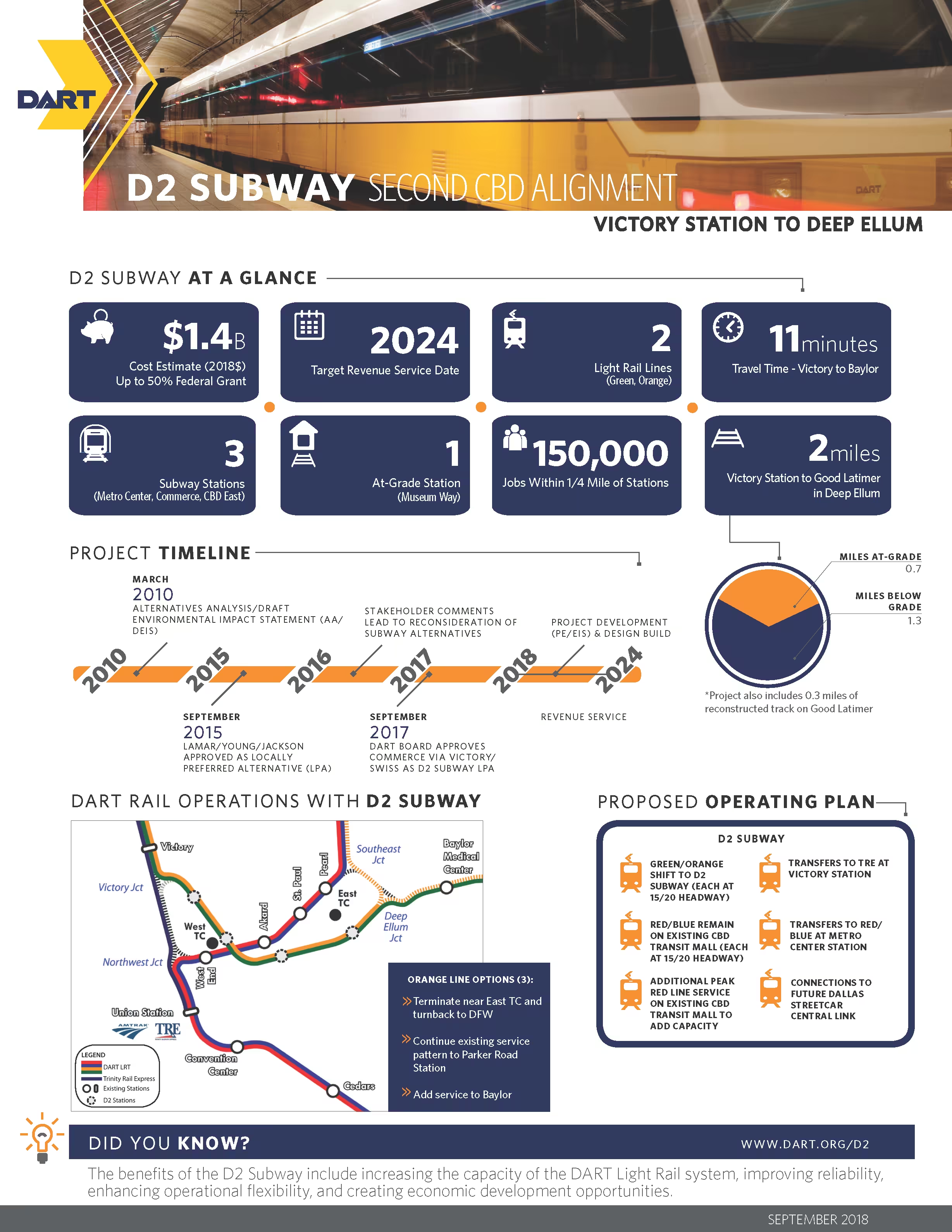
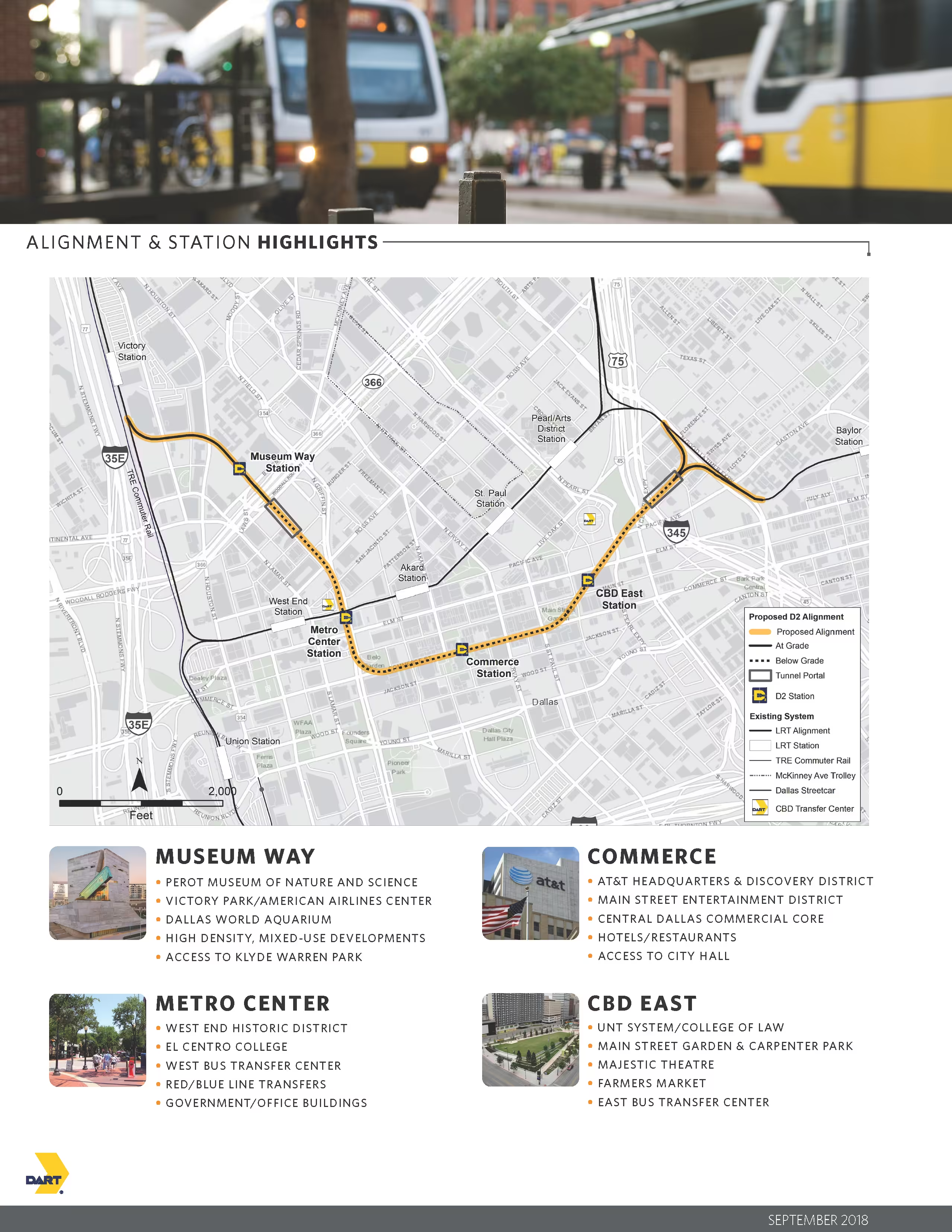
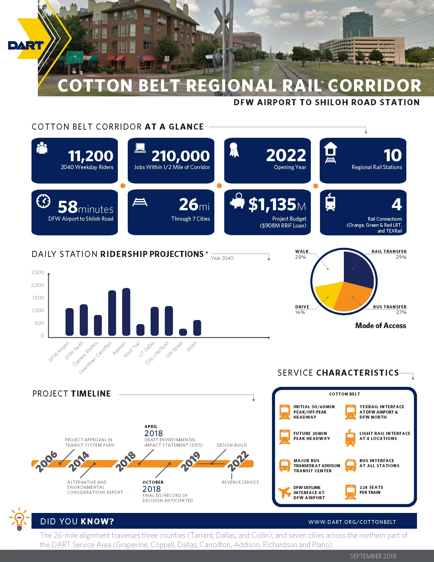
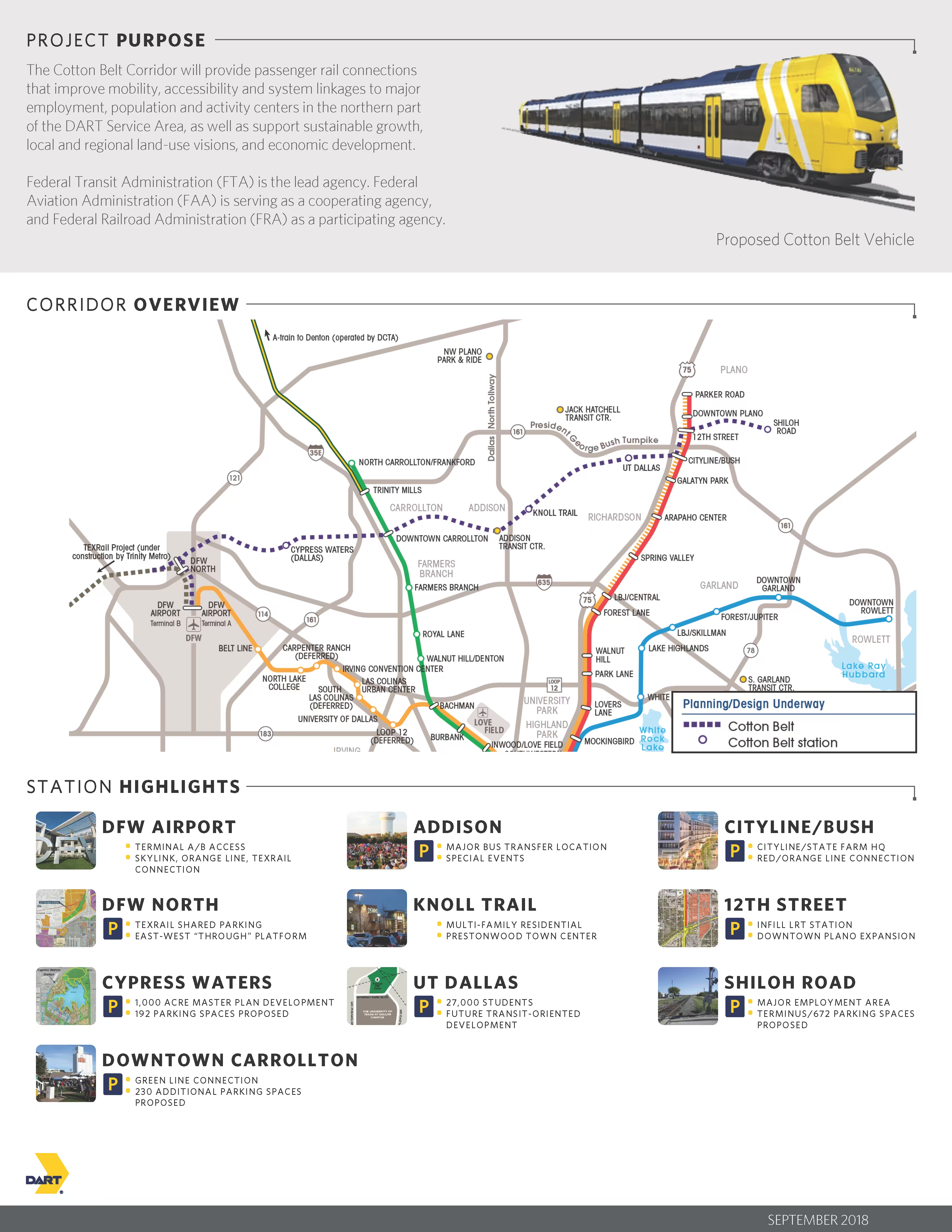
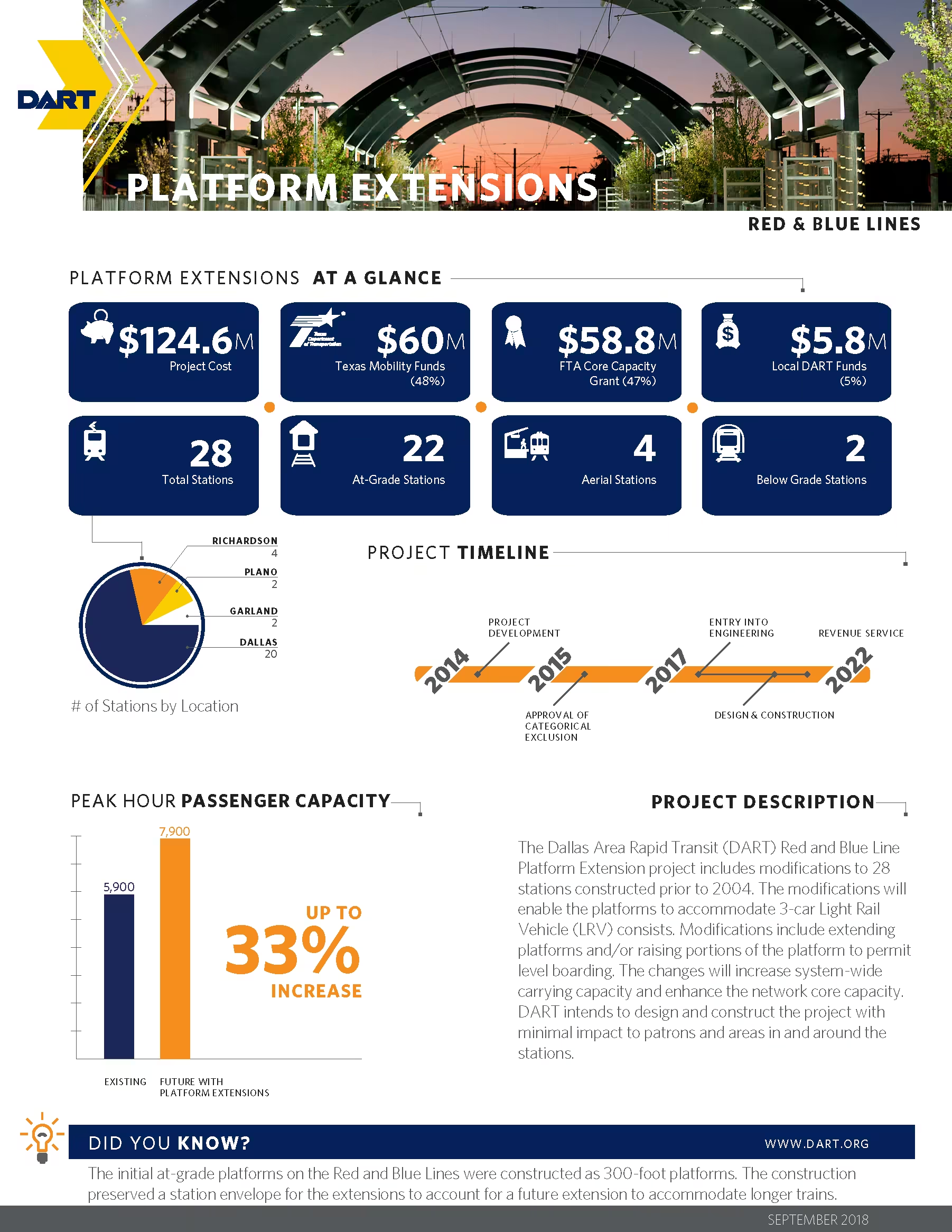
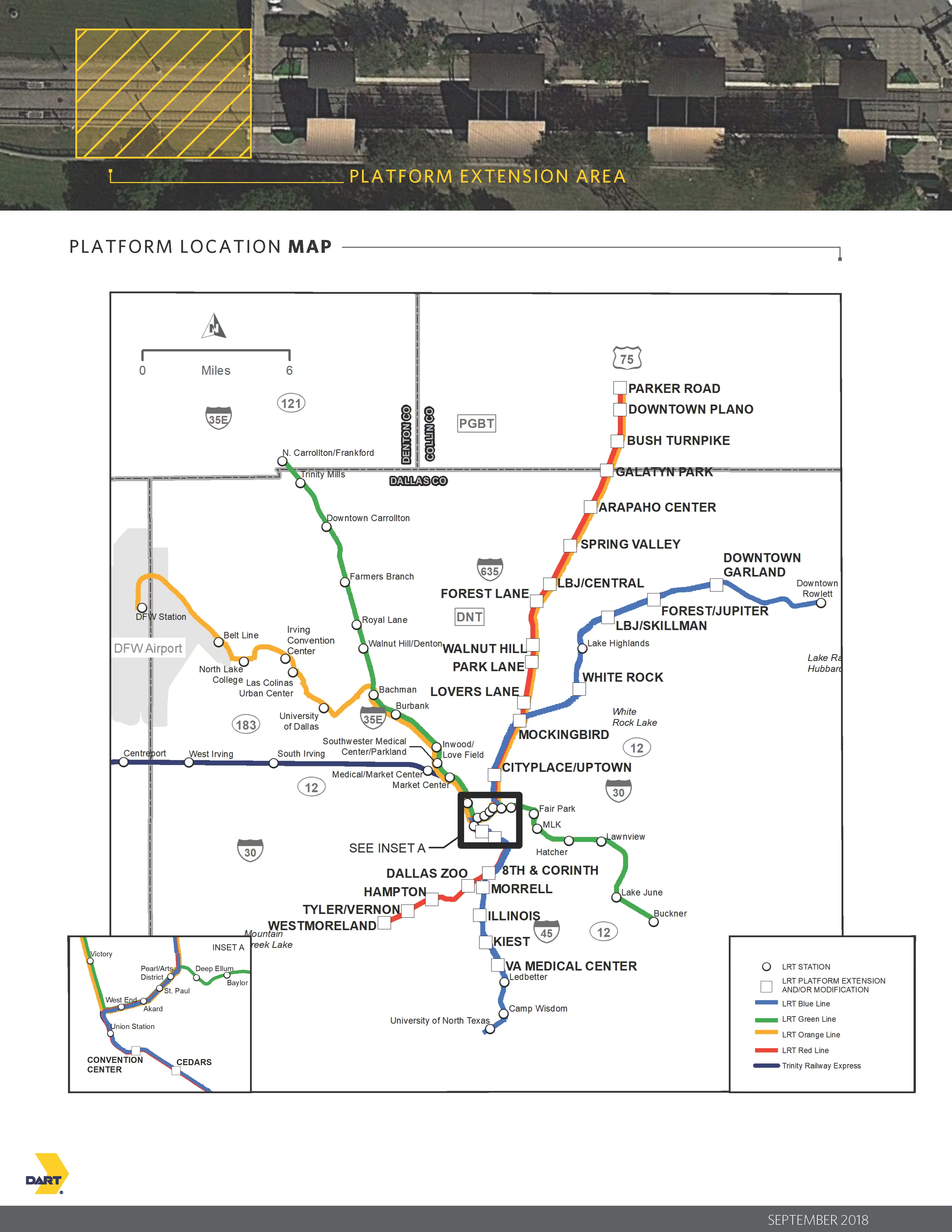
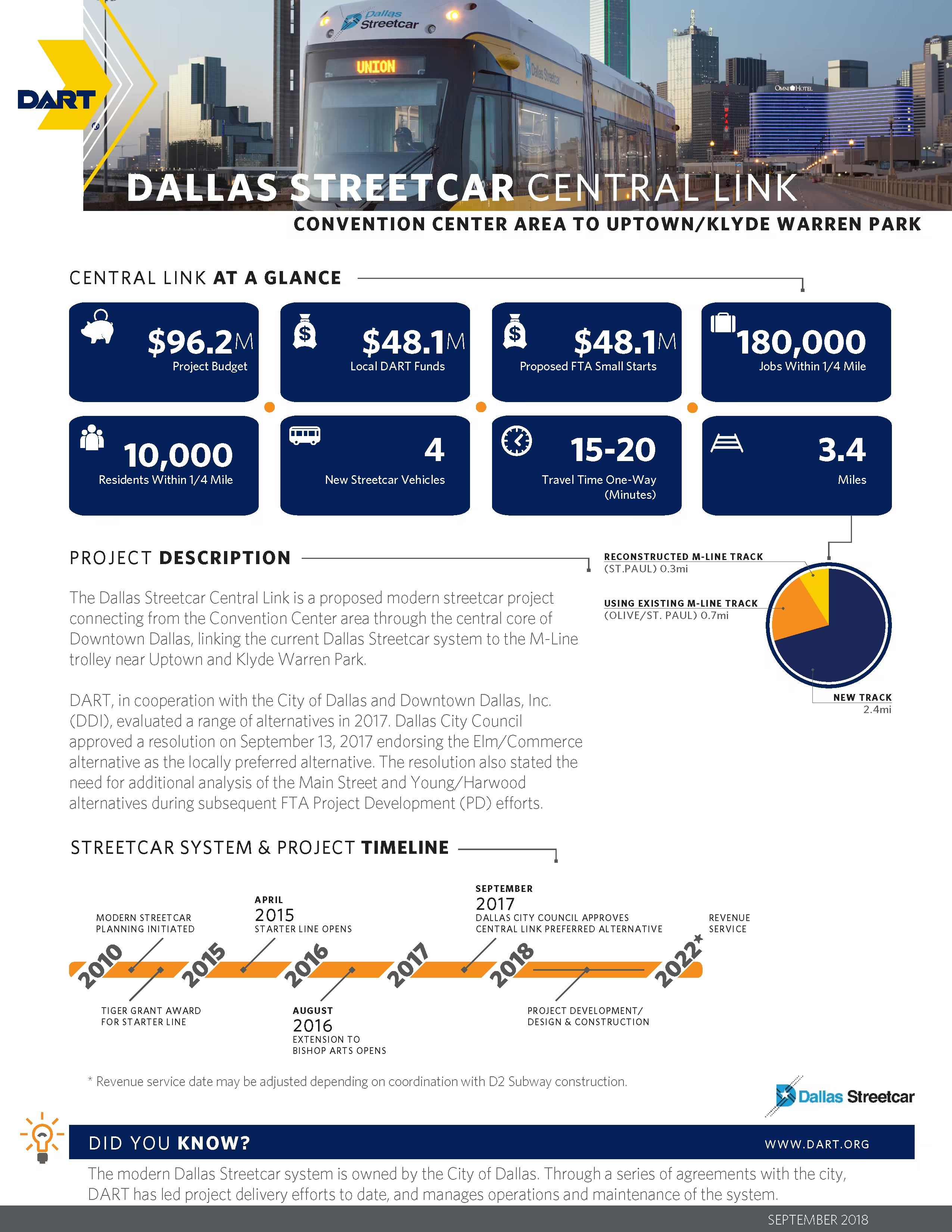
DART fact sheets
Public outreach, stakeholder briefings, and grant applications, on two pages each.
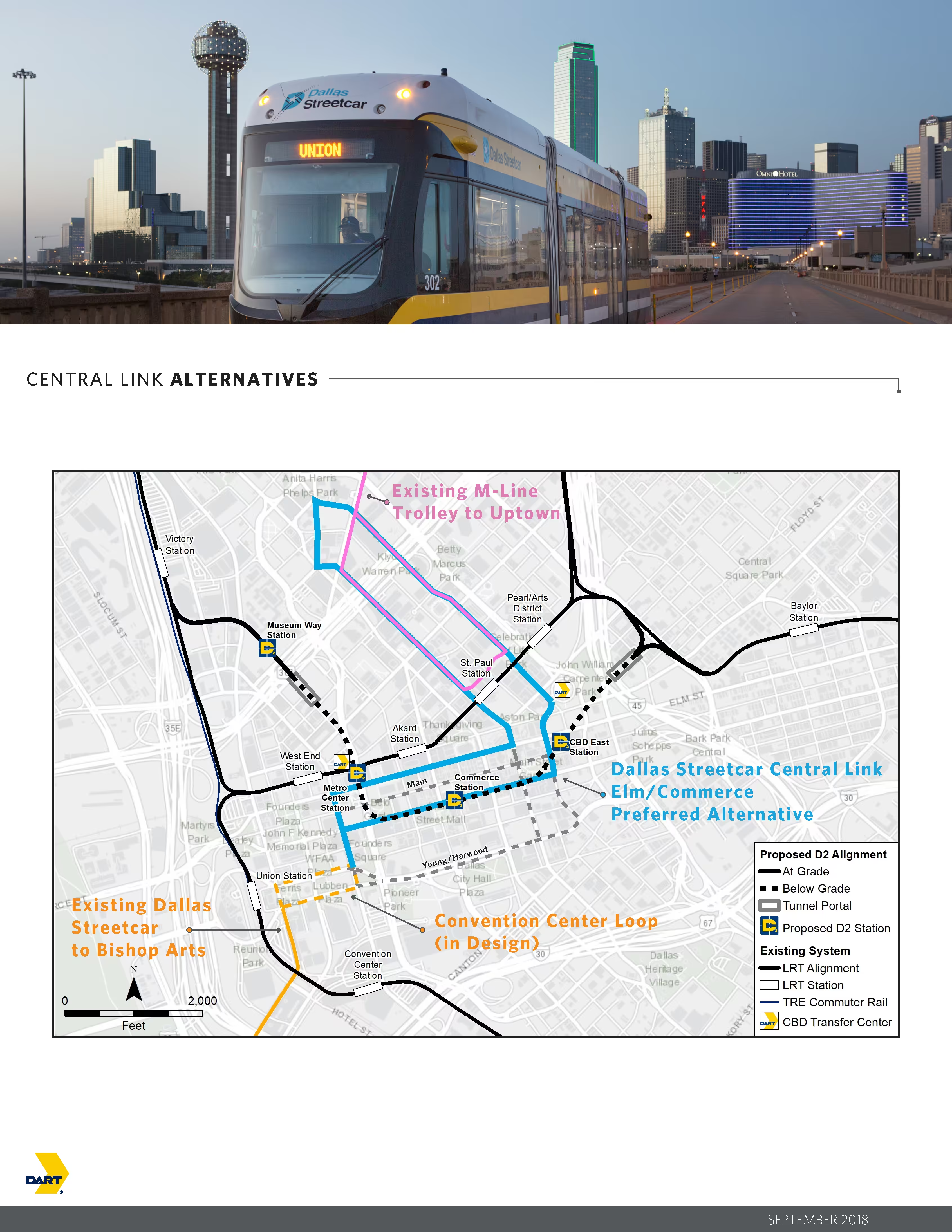
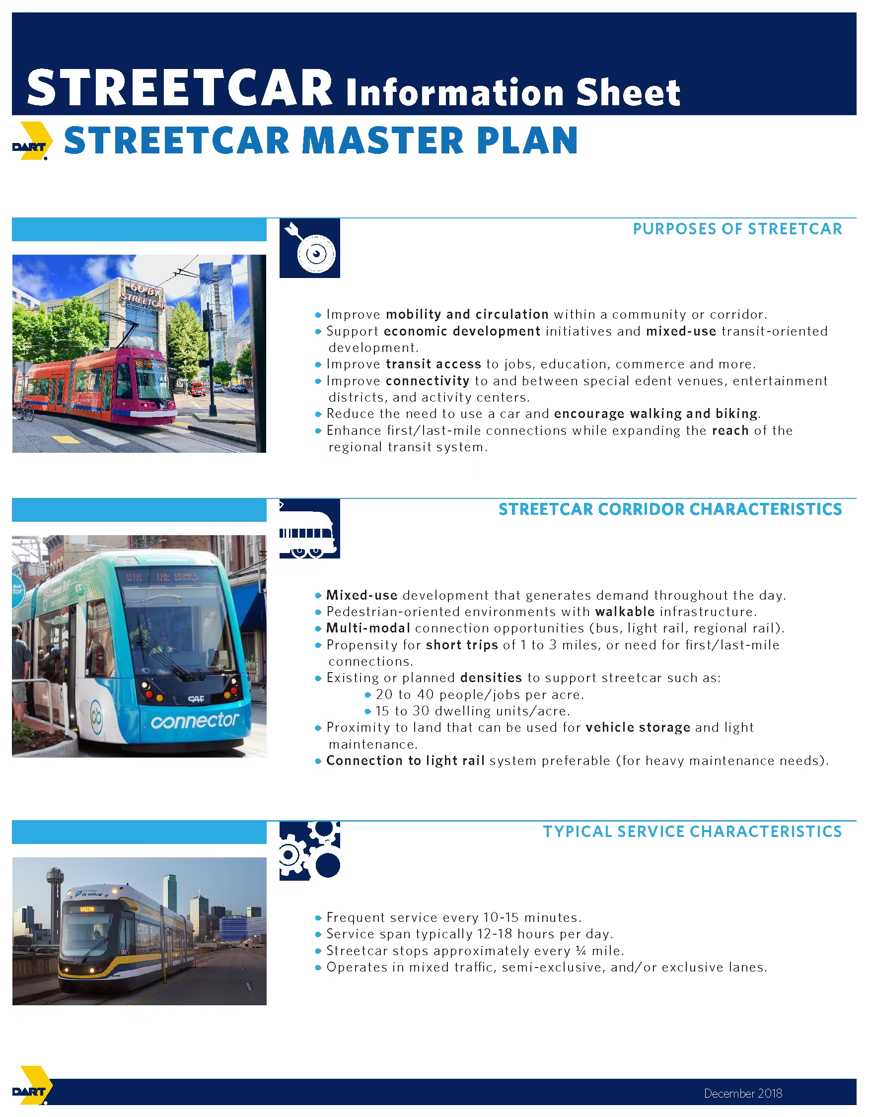
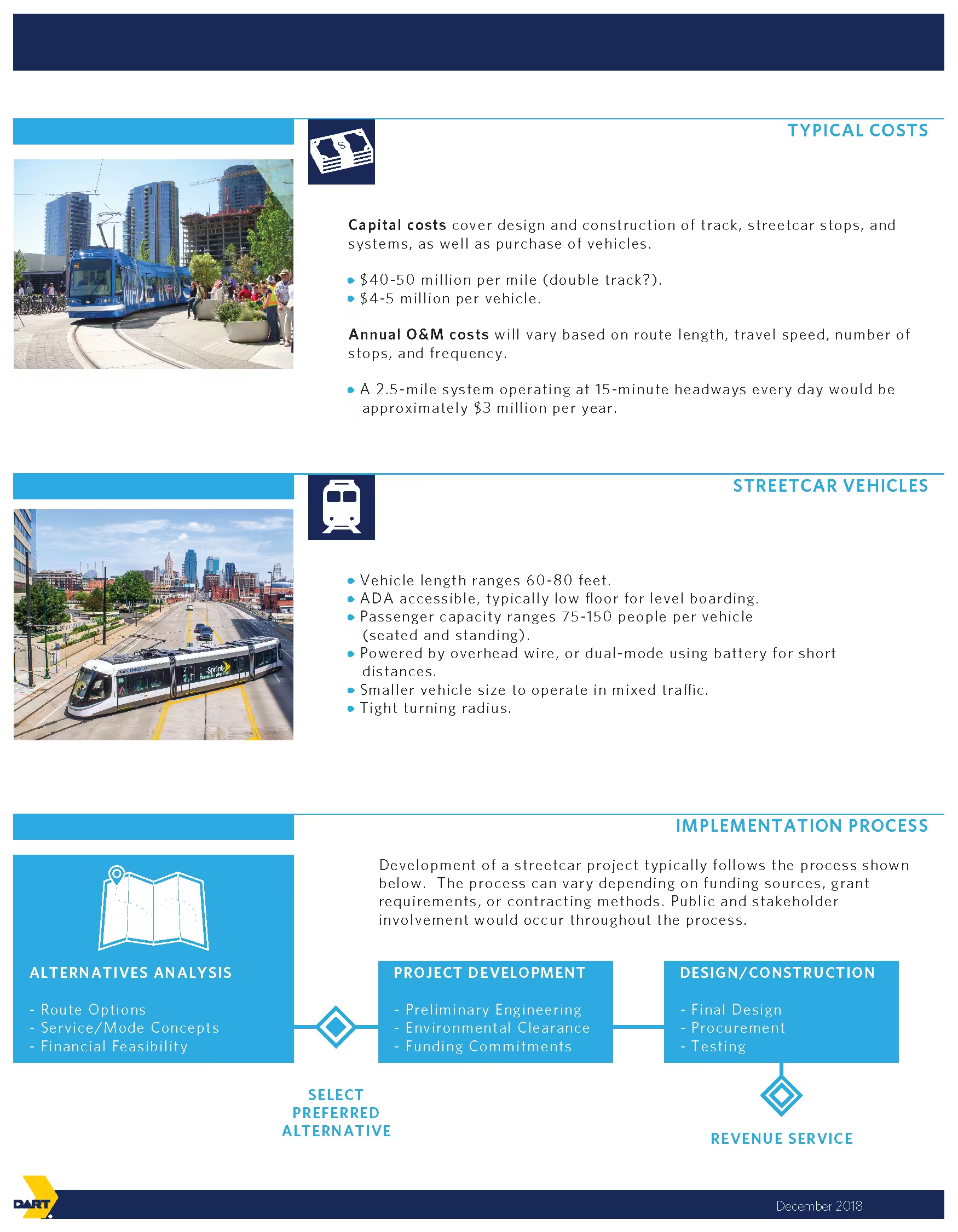
Five sheetsDallas Area Rapid Transit needed documents that a resident, a council member, and a federal reviewer could all read: what the project is, what it costs, when it opens, what it changes. I structured the engineering and planning data into a fixed layout, built the icons, maps, and charts, and kept every sheet inside both HDR's and DART's brand standards, then prepared print-ready files for distribution.
What the sheets had to do
Design and production- Hold complex data in a readable layout.Budgets, ridership, timelines, and alignments in one fixed structure across the series.
- Lead the eye to the numbers that matter.A clear hierarchy from at-a-glance figures to detail.
- Draw the graphics, not stock them.Custom icons, maps, and charts per project.
- Stay inside two brands at once.HDR's standards and DART's, on every sheet.
- Ship print-ready.Files prepared for client distribution.
Who they reached
Collaboration and impact- Engineers, planners, and marketers refined content and visuals together.
- Residents and stakeholders got the project in plain terms for community engagement.
- Federal reviewers saw the same material in grant applications.
- Rail expansions, subway alignments, streetcar systems, and platform extensions all went through the same format.
Maps and infographics
Project areas, corridors, and competitive comparisons for proposals and interview presentations.
Proposal graphicsHow they were made
Design and developmentMaps ranged from a simple overview to a dense regional analysis. I integrated GIS data, aerial imagery, and client-provided information in Illustrator and Photoshop, layered the visuals so routes, stations, and development zones read clearly, and built consistent iconography, legends, and color systems so a reader could move between maps without relearning them. Every map matched HDR's brand standards and the proposal templates it lived in.
What they did for the pursuit
Strategic use- Made the differentiators visible.Key benefits and technical approaches, drawn rather than described.
- Compared the alternatives.Comparative maps that showed where competing solutions fell short.
- Translated for non-technical readers.Infrastructure and planning concepts for decision-makers and review panels.
Section models and renders
Spatial, structural, and environmental intent, modeled from engineering drawings.
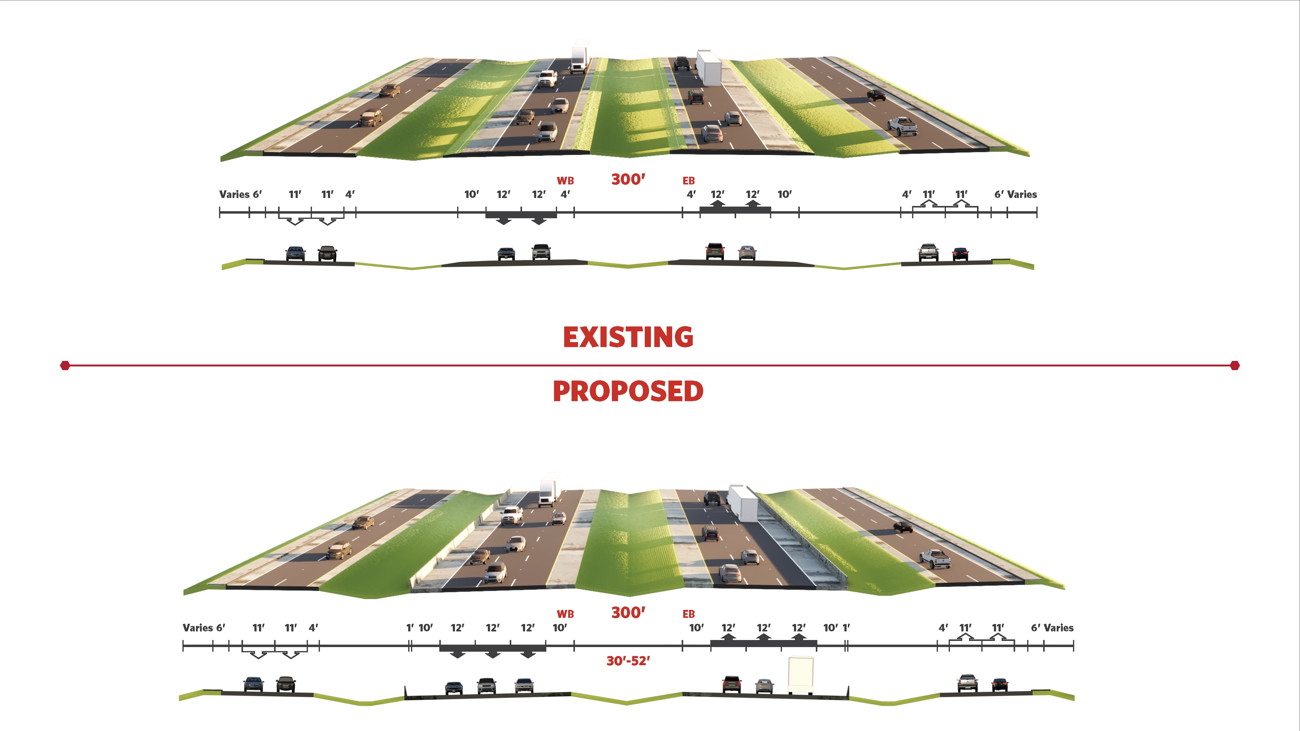
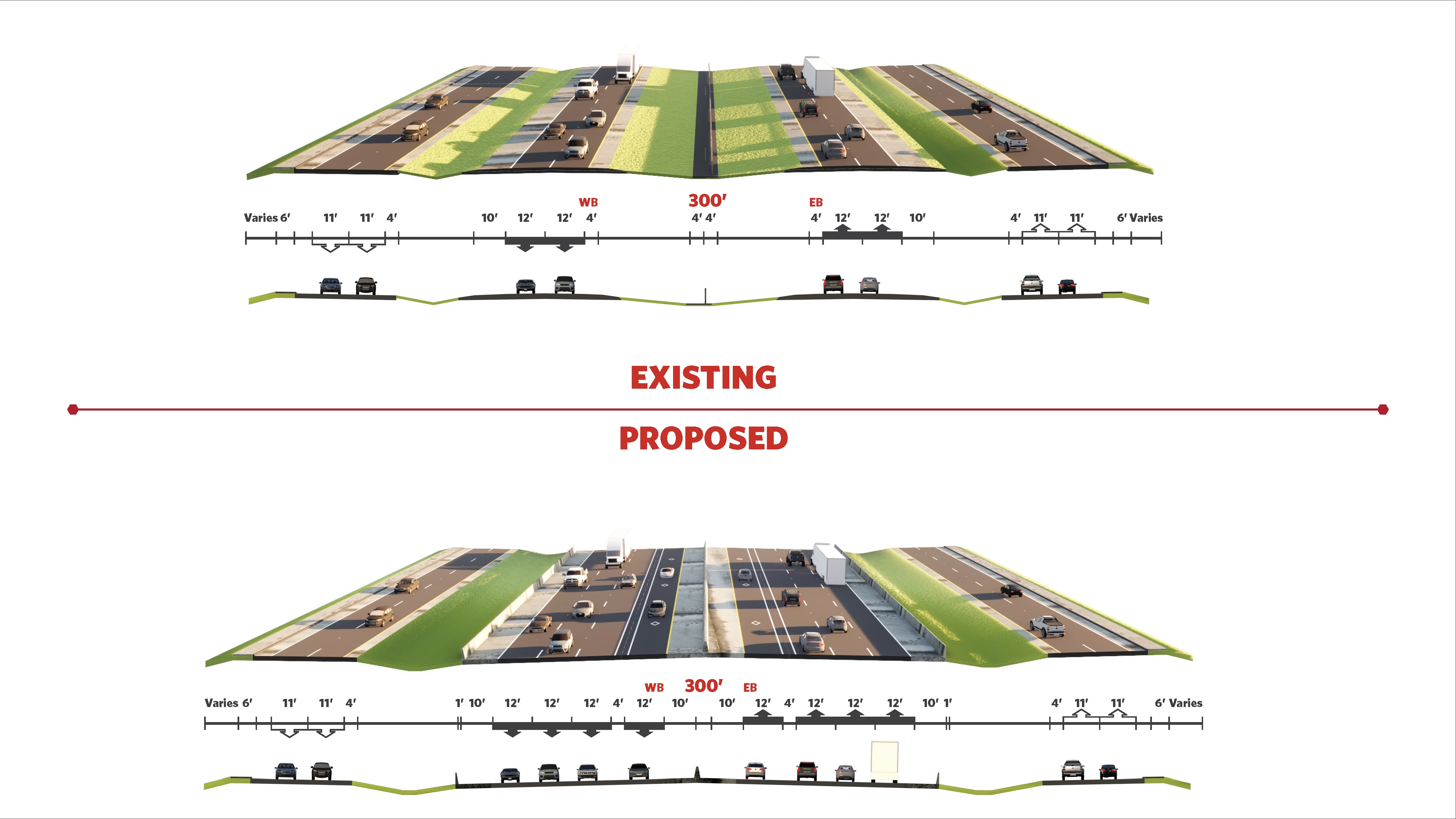
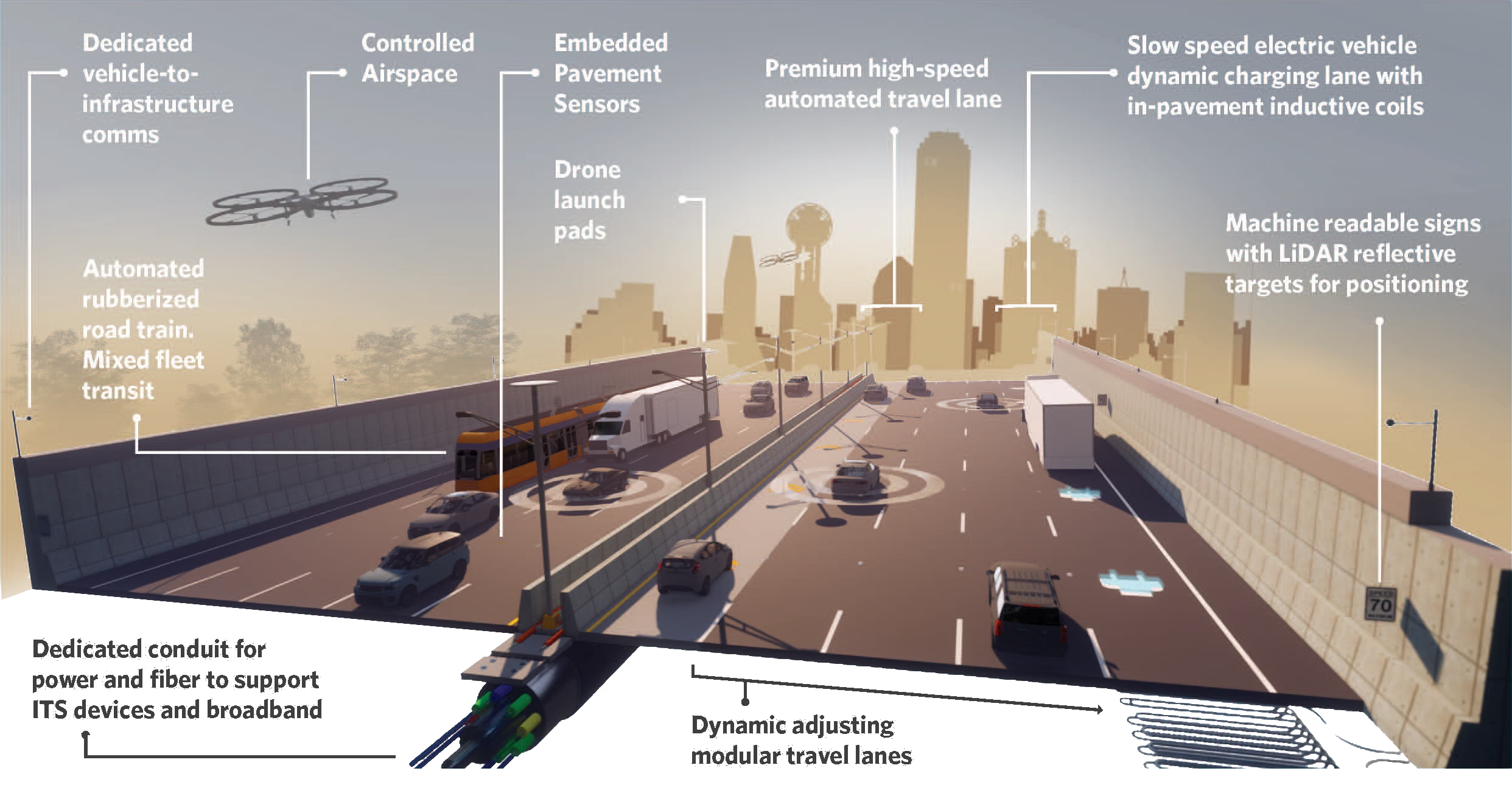
2D and 3DWhen a plan view could not carry the idea, I built it. SketchUp for accurate spatial modeling from the engineers' and architects' drawings, Blender for lighting and composition, Photoshop and Illustrator for post-production. Some renders were realistic, some deliberately conceptual, depending on the audience and how far along the project was.
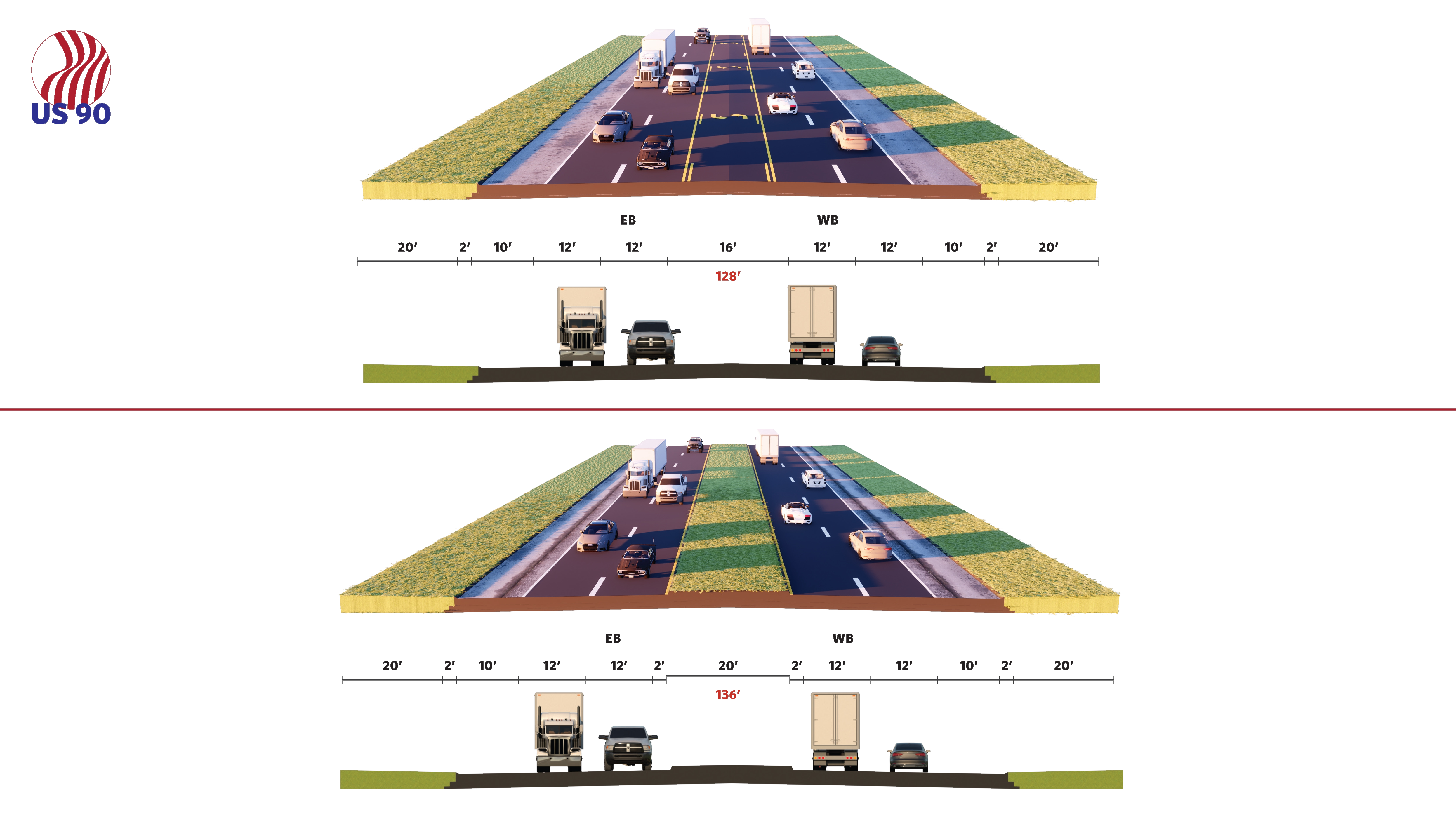
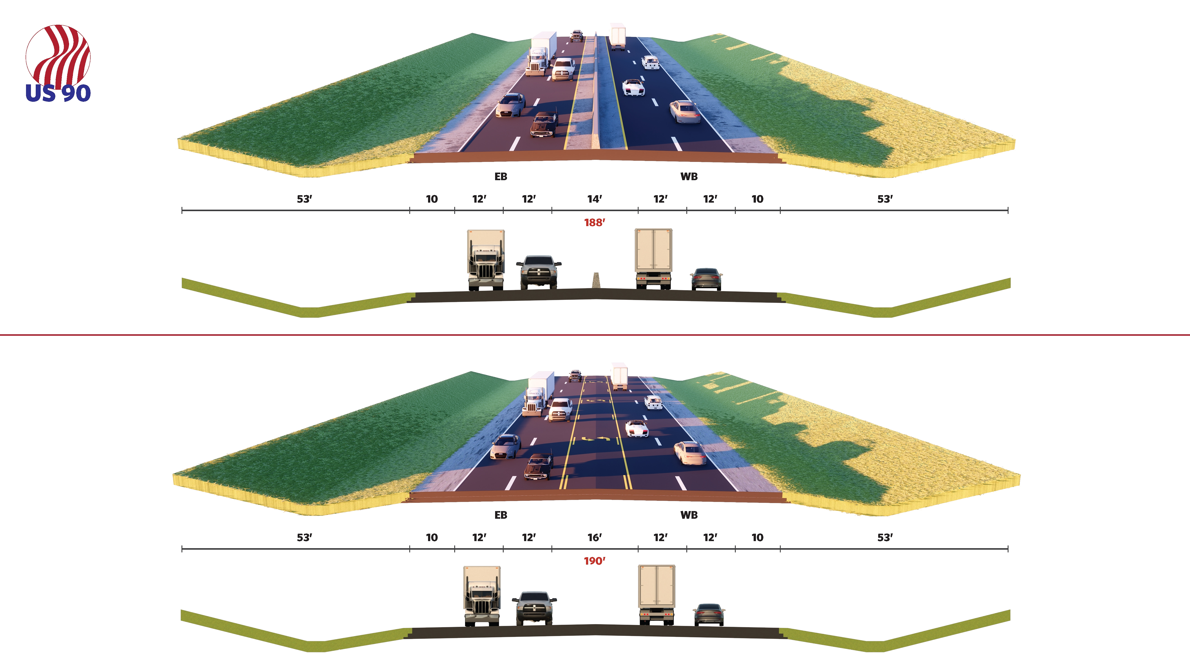
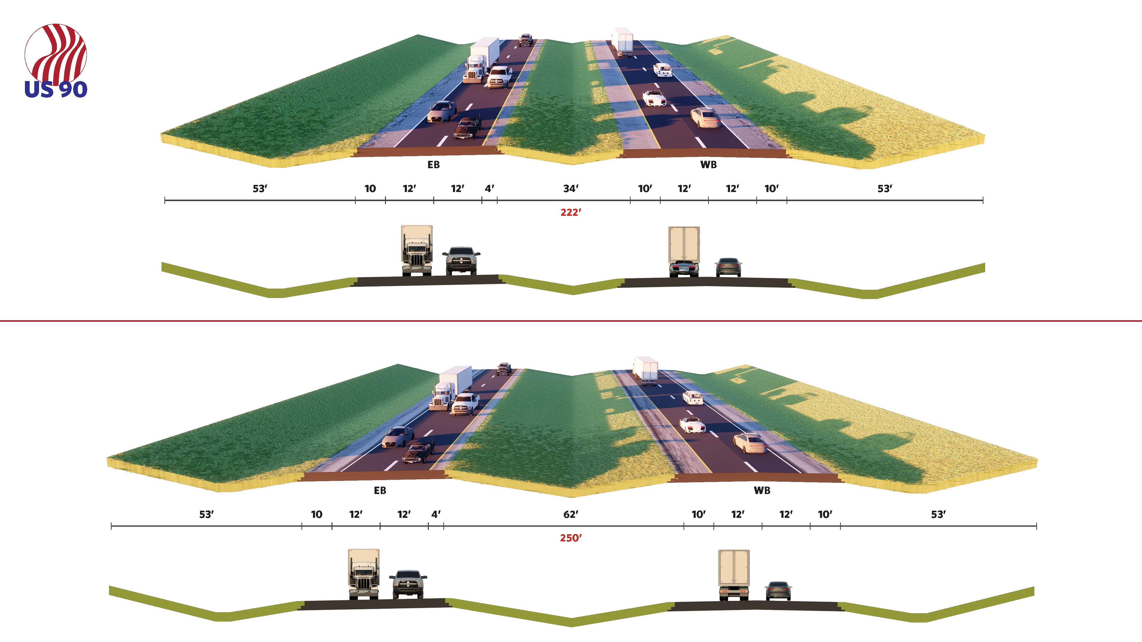
Figures 8 to 10: existing and proposed sections along US 90 for TxDOT, drawn as 3D section models so lane configuration, medians, and right of way read at a glance.
What it did
Where the visuals landed, and what they helped win.
OutcomeIn the room
ReceptionThe visuals went into proposals and interview presentations, and helped pursuit teams communicate scale, function, and design intent to decision-makers and review panels.
- Proposals won. Several of the proposals this work supported went on to win funded, multi-million-dollar client projects.
- Clearer proposals. Visual strength and clarity of HDR's client proposals and interview presentations, with the differentiators drawn rather than described.
- Reused across teams. Fact sheets, maps, and renders served road, bridge, water, and engineering departments, and visual communication teams company-wide.