Projects · 02 · Cup & ConeCincinnati, OH · 2025
Made With:
Critical role icon
End-to-End UX/UI Designer
Calendar icon
May '25 - Aug '25
Crown award icon
Google UI/UX Certified

Food ordering has never been more convenient, and that convenience has never cost more.

Cup&Cone gives up delivery to own the one thing delivery can never guarantee: a quality experience from the first tap to the first bite.


Discover

Delivery apps compete on speed and reach, but they do it by sacrificing quality and inserting a middleman no one controls. Every order leaves the kitchen and passes through a stranger's hands before it reaches the customer, and the handoff is where accuracy, freshness, and goodwill quietly break down.
63%
of consumers hit at least one incorrect delivery order in a year
eduMe • secondary research
9 in 10
had an order go wrong; over half suspected the driver ate it
Circuit • secondary research
66%
blame the business, not the courier, when an order is wrong
eduMe • secondary research

Pickup removes the middleman entirely. No third party to misplace, mishandle, or resent, and no reputation to lose in a handoff that never happens. Delivery apps offer it, but as a toggle inside a flow built for something else.

Crown icon
Where Cup & Cone Sits
Primary Model
Pickup
Customer Relationship
Vendor Location
DoorDash / Uber Eats
Delivery Marketplace
A toggle inside a delivery-first flow
Platform owns the customer
Fixed addresses
Generic Ice Cream Truck
Walk-up at the window
The only option, no ordering ahead
Ends at the transaction
Moves, but not findable in advance
Cup & Cone
Pickup-only, order ahead
The entire product
First party
Moves, and the app assumes it
Nobody serves the elevated, made to order, pickup first customer. That is the gap Cup&Cone fills.

So who is the customer? In Define, I mapped who actually shows up for this, and the moments where the ordering experience has to earn their trust before it ever earns their $$$.

Define

Four friction points keep the quality driven customer from getting an experience that matches the product
Quality gets lost in the handoff
Delivery hands a carefully made order to someone with no stake in it. By the time it arrives, the thing that made it worth buying is gone.
The menu hides what makes it special
Made to order creations and catering options get flattened into generic list items, so customers never see the range that sets the brand apart.
Ordering ahead is an afterthought
Customers want to plan around a pickup, but most ordering flows treat timing as a guess rather than a promise they can rely on.
Changing your mind is punished
Plans shift, but most apps make editing or canceling an order confusing or impossible, turning a small change into a reason not to order at all.
To understand these needs at a human level, I created two personas representing the customers this experience is built for.
Ava user profile image
Ava
Birthday cake - date of birth icon
28 Yrs
Location pin icon
Cincinnati, OH
Critical role icon
Marketing coordinator
Ava, 28, wants a premium, made-to-order treat she can rely on, but delivery apps keep turning a small indulgence into a gamble on melted, wrong, or mishandled orders.
Jens user profile image
Jens
Birthday cake - date of birth icon
40 Yrs
Location pin icon
Columbus, OH
Critical role icon
Office manager
Jens, 40, needs to cater a memorable event without gambling on a vendor he can't vet, because a botched order in front of guests reflects directly on him.
Mapping the pickup order from first craving to first bite surfaced where the experience has to build confidence.
1
Discover
2
Order
3
Timing
4
Confirm
5
Fulfillment
6
Enjoy
Ava
Action
Opens the app, find the nearest truck and where it is now
Feeling
Hopeful, rushed
Outcome
A truck within reach, no hunting across sites
Jens
Action
Opens the app to research catering for an event
Feeling
Hopeful, pressed
Outcome
Finds catering upfront instead of digging
Ava
Action
Browses the full menu and customizes a creation
Feeling
Engaged
Outcome
Sees the made-to-order range, not a flat list
Jens
Action
Provides event details, builds the catering order
Feeling
Focused
Outcome
Catering range is visible and easy to shape
Ava
Action
App shows prep time and their travel time from current location
Feeling
In control
Outcome
Knows when to leave so the order is fresh on arrival
Jens
Action
Checks truck availability and books the event date and window
Feeling
Cautiously optimistic
Outcome
Locks a reliable slot, no chasing confirmation
Ava
Action
Reviews order, total, and cancellation window, then pays
Feeling
Reassured
Outcome
Knows the cost and the plans can still change
Jens
Action
Reviews full order and cancellation terms, pays securely
Feeling
Relieved
Outcome
A big commitment still has a safety net
Ava
Action
Heads over and collects the order directly from the truck
Feeling
Confident
Outcome
No third party, nothing lost in a handoff
Jens
Action
Truck arrives at the event at the agreed time
Feeling
Alert, trusting
Outcome
The brand shows up directly, quality intact
Ava
Action
Gets exactly what was made
Feeling
Satisfied
Outcome
The product arrives as intended
Jens
Action
Event runs, guests are served
Feeling
Happy, accomplished
Outcome
A smooth event that reflects well on the host
With the user journey mapped, the next step was to identify and organize all potential features. I created a comprehensive list of ideas and grouped them by category, using color coding to visualize relationships and priorities.

With a deep understanding of user pain points, detailed personas, comprehensive journey maps, and a prioritized set of features, I began the Develop phase: wireframing user flows, refining information architecture, and building low-fidelity prototypes that would guide self-directed validation before high-fidelity design.

Develop

Four friction points became four questions the design had to answer.
How might we...
Keep a made-to-order product intact from counter to first bite?
How might we...
Show the range of what's possible instead of a flat list?
How might we...
Turn pickup timing from a guess into something to plan around?
How might we...
Make changing your mind cost nothing?
With those four questions in front of me, the next step was translating them, along with the grouped and prioritized feature list, into structure. The sitemap and information architecture organized the app around eight destinations, ensuring users could move through the experience without ever feeling lost.
Cup & Cone — Mobile
Homepage
(Location Select, Featured Items, Quick Order, Account Access)
Menu & Discovery
  • Menu browsing
  • Menu item cards with pricing
  • Dietary & allergen tags
  • Product detail pages
  • Nutrition & ingredients
  • Add to bag
  • +
Custom Build
  • Custom build flow
  • Container selection
  • Flavor selection
  • Topping selection
  • Reset build
  • +
Ordering & Bag
  • Shopping bag
  • Editable bag contents
  • Live counters
  • Subtotal, tax & total
  • Secure checkout
  • +
Order Tracking & Cancellation
  • Four-stage tracking
  • Order status updates
  • Post-purchase cancellations
  • Order numbers
  • +
Gifting & Group Orders
  • Order gifting
  • Text-link redemption
  • Group ordering
  • Configurable windows
  • Named group pickup
  • +
Catering
  • Catering flow
  • Event type
  • Date & time
  • Event duration
  • Guest count
  • +
Locations
  • Truck location selection
  • Switch locations
  • Nearest-truck lookup
  • Location services
  • Pickup-only
  • +
Account, Settings & Support
  • My account
  • Saved payment
  • Order history
  • Color themes
  • Font sizes
  • Notifications
  • Support contact
  • +
I ordered from Wingstop on both Uber Eats and DoorDash, holding the restaurant constant so only the app changed. The flows were nearly identical, so I treated them as the proven default, then decided where Cup&Cone should follow and where it should not.
Uber Eats logo
Apple icon
The lesson is pickup and customization
Eye icon
The pattern
Pickup is a real mode and not a buried setting. Switching to it changes the whole offer, dropping the wait to an eight minute ready time, and menu items open into a series of required choices before anything reaches the cart.
Checkmark icon
My decision
I kept product pages simple and moved customization into a Build flow. Wingstop customizes every order, Cup&Cone mostly does not.
DoorDash logo
Apple icon
The lesson is group ordering
Eye icon
The pattern
DoorDash never asks who you are inviting. Its group order generates a share link and hands off to your messaging app, so the invite rides on contacts your phone already holds.
Checkmark icon
My decision
I had designed recipient entry as typed name and phone number fields, which asks people to recall numbers from memory. Their approach was better, so I am adopting the share link approach.
Flag icon
Future Consideration
Right now the menu takes your order but not your preferences. Adding per-item customization would let people hold an ingredient, add a topping, or swap one thing for another, which is how they actually order in person.
With the structure in place and the competitive audit's lessons folded in, I mapped how people actually move through it. Three flows carry the experience: how someone gets in, how an order gets built, and how gifting branches off a single button.
Truck first, because menu and pricing are truck specific.
Cup and Cone entry, account setup, and persistent navigationHome screen leads to sign in with Google or account creation, then initial preferences, landing on the Menu screen with three peer tabs. Menu, Build and Cater share a persistent top nav; the hamburger icon on any of the three opens the Scoop navigation hub.Home screenSign in with GoogleCreate accountAccount detailsName, email, phone, passwordInitial preferencesNotifications, location, dietaryMenu screenLands here, no dashboardMenuBuildCaterPersistent top nav on all three: hamburger, gift icon, bag iconThe ScoopOpens via hamburger, any tabMenuBuildCaterBagTrackingSettingsSupportAccountLog OutSettings: autopay, notifications, themes, font sizesEntryMain flowsNav hubScoop items
Three paths, one bag. A build enters as one item, not three.
Cup and Cone ordering converges on the bagMenu, build and catering converge on the bag, then checkout, then order tracking.Browse menuItem detailAdd to bag↻ back to menuBuild your ownContainerChoose flavorsAdd toppingsAdd to bagCateringOccasion, guests, budgetVenue detailsDietary & requestsReview & confirmBook cateringShopping bagLive totals, editableMenu/build in bag?Yes → pickupNo → paymentPaymentConfirmationOrder trackingPlaced → Received → Preparing → Ready3 tracked line items (menu/build, gift/group, catering)OrderingBag & checkout
One button. Adding a second recipient turns a gift into a group order.
Cup and Cone gift and group overlayThe gift icon on the Menu, Build, or Cater screen opens an overlay where the user shares one invite link to as many recipients as they want, by SMS or email, with an optional personal message and an ordering window. There is no separate branch for gift versus group ordering.Menu, Build, or Cater screenGift & group overlayOpens over the ordering screenInvite recipientsShare a link via SMS or emailOptional personal messageSent along with the linkOrdering window30 min, 1 hr, custom, or noneAdd to bag
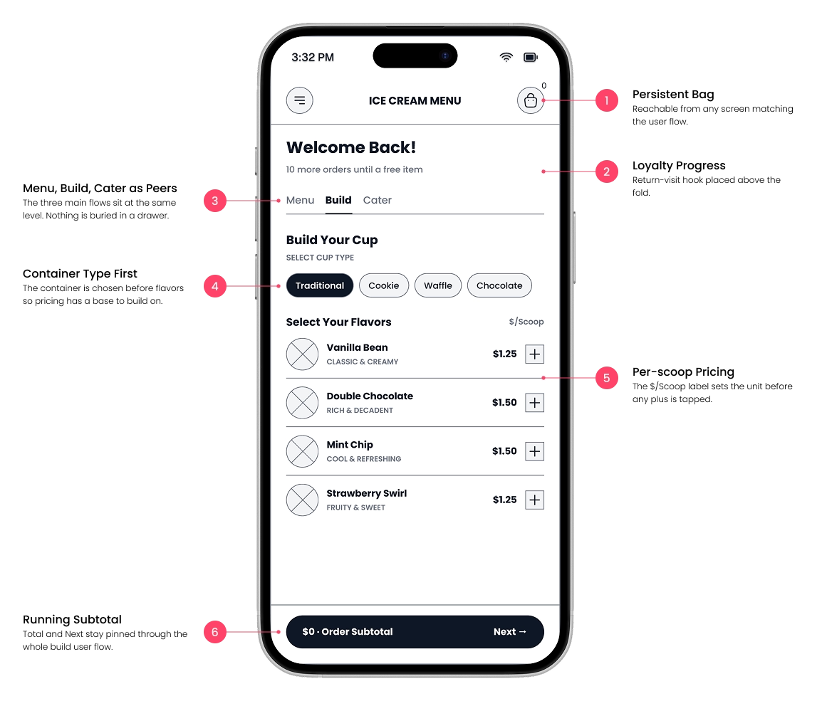
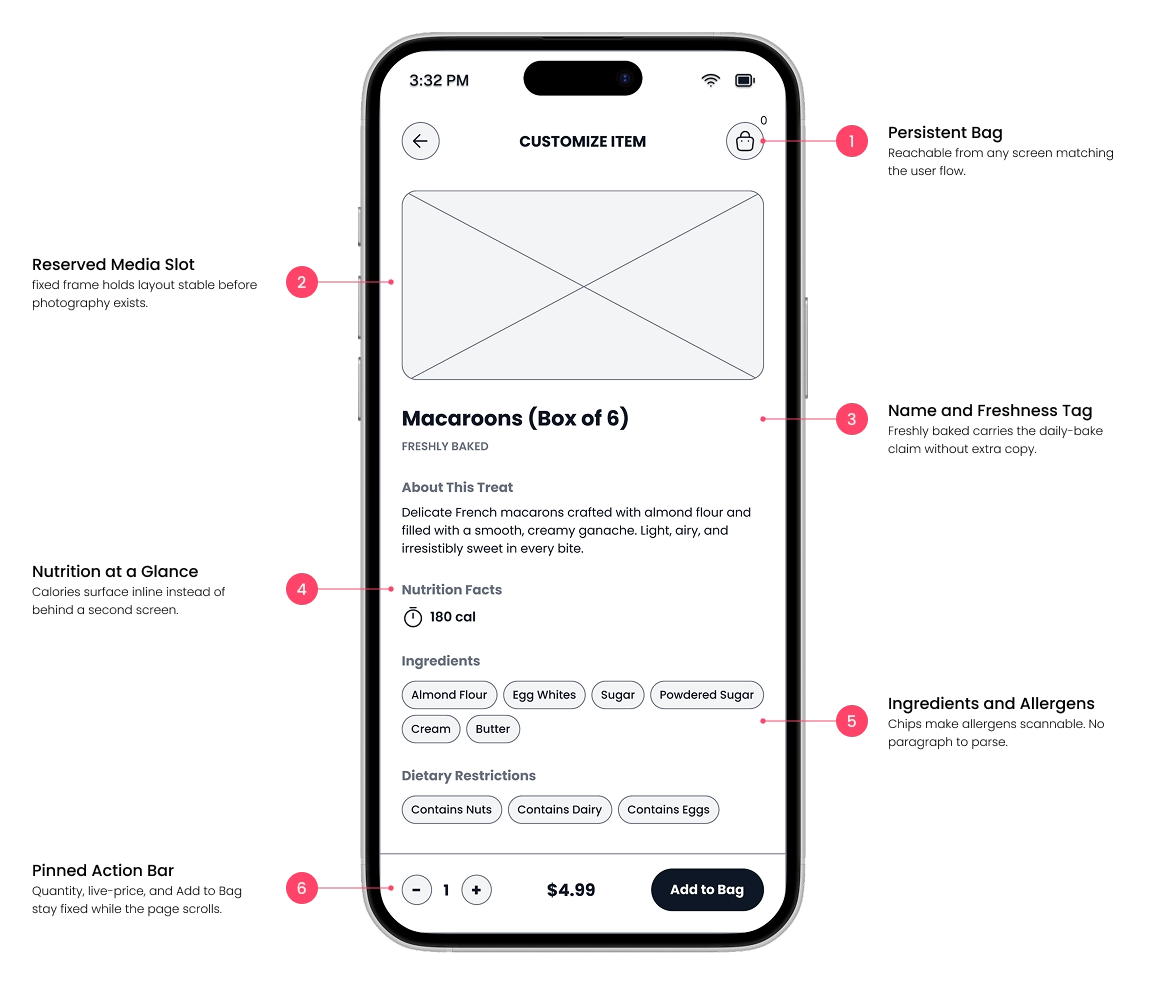
With the flows mapped, I moved into digital wireframes, sharpening proportions, spacing, and component relationships while keeping the focus on structure over visual design.
Annotated digital wireframe - build screen
Annotated digital wireframe - menu item screen
With each screen defined, the next step was connecting them. The lo-fi prototype brought the wireframes to life, allowing me to validate flows and the overall experience through self-directed testing before high-fidelity design.

Structure, flows, and a competitive audit gave me a defensible starting point. In Deliver, I turned it into high-fidelity design, and stress-tested it myself to catch edge cases, the self-directed testing that Next Steps builds on with real usability sessions.

Deliver

Research and journey mapping surfaced five outcomes the design had to deliver on. Each maps back to a friction point identified earlier, and each shaped a specific part of the final product.
Findable
Nearest-truck lookup and location switching shows which truck is serving where, so a moving franchise stays as easy to order from as a fixed address
Expressive
A custom build flow with containers, per-scoop flavors, and toppings shows the made-to-order range that a flat menu list would flatten
Plannable
Configurable ordering windows and four-stage tracking turn pickup timing into a ready time customers like Ava can plan around.
Reversible
Editable bag contents and item-level cancellation let plans change after checkout, so a shifting schedule never becomes a reason not to order.
Event-ready
Catering and group ordering with guest counts, event details, and text-link redemption let planners like Jens order for a crowd without vetting a vendor blind.

Before the final prototype, it's worth pausing on how these outcomes actually get built. The next three pieces, Under the Hood, Design System, and Know Before You Order, pull back the curtain on the mechanics, the visual system, and the accessibility choices running underneath everything you just read.

One tap. Four systems quietly doing their job. Every Purchase tap fires 307 actions in a precise order. Click a step below to see what it does, or hit Play sequence to watch the whole thing run.
Simple

Purchase

Click a step above to see what it does — or start with Purchase.

307 actions per tap
47 snapshot variables
3 possible outcomes

Snapshot

Before anything else happens, the order's real details — quantities, totals, even the catering event date — get copied into their own frozen variables. Nothing after this point can quietly change what the customer sees for this order.

Paid/menuTotalPaid ← #menuTotalCost
Freezes the order total before any reset can touch it
#cookiesQuantityOrdered ← #cookiesQuantity
One of 46 per-item snapshots — repeated for every menu item and flavor
Booked/saveTheDateBooked ← #saveTheDate
Catering's event date is locked in, separate from the live form

Reset

With the order safely frozen, the shopping bag clears for whatever's next. The catch: "clear" isn't always zero — a fresh item should show quantity 1 at its real price, not a blank $0.

#cookiesQuantity ← 1
Matches the floor the stepper already enforces — not 0
#cookiesTotalCost ← alias(#cookiesUnitCost)
One real unit, at its real price — not a flat zero
#flavorCost ← 0 · #toppingsCost ← 0
Found mid-build: these two were never reset, letting old totals bleed into a new order

Guard

Menu, build, and catering orders can run independently. A guard checks before clearing anything, so purchasing one can't silently erase another that's still active.

IF hasCatering == false AND cateringOrderActive == false
Only clears catering's state if there's truly nothing active to protect
// without this guard:
An active catering order would vanish the moment an unrelated menu order was purchased

Route

One purchase, three possible confirmation screens — decided entirely by what's actually in the order.

Order Confirmed

Menu or build only — pickup timing shown

showPickupContent

Event Confirmed

Catering only — event date, no pickup info

showCateringOnlyContent

Order & Catering Received

Both at once — one merged message

showBothContent
Every color in the product remaps from the same token names, swapping the whole visual identity is a mode switch, not a redesign. In the actual product, this switch lives on the Settings screen, reached through the hamburger menu. Tap/click a theme below to see the same card update live.
Sorbet
Default theme
Creamsicle
Alternate theme
Dream Berry
Alternate theme
Cup & Cone
Order now
Waffle Cone · Sea Salt Caramel
Two scoops, house-made cone, allergen tags shown
Add to bag
Calories, ingredients, and dietary restriction tags surface directly on both the menu list and each item's detail screen, before a customer has to tap through or hunt for them. This isn't tied to one specific outcome above; it's a cross-cutting consideration for anyone managing an allergy or dietary need, built into the browsing experience itself rather than added as an afterthought.
Macaroons (Box of 6)
NutsDairyEggs
$4.99
Brownies (Box of 4)
GlutenDairyEggsSoy
$3.99
Cookies (Box of 3)
GlutenDairyEggsNuts
$3.99
🔥 180 cal

Macaroons (Box of 6)

Delicate French macarons crafted with almond flour and filled with a smooth, creamy ganache. Light, airy, and irresistibly sweet in every bite.

Ingredients
Dietary Restrictions
$4.99

Pickup only pays off if the trip is worth it, and it is only worth it if everyone can make it. Allergen tags, adjustable type, themes, and voice input run through every outcome that follows.

Before the high-fidelity prototype, here's where five of Cup & Cone's key outcomes were actually addressed in the design. Tap an outcome to see the real flow behind it: nearest-truck lookup, the container and flavor build, order tracking, cancellation, and catering and gifting.
Findable
Nearest-truck lookup

A moving food truck stays as easy to order from as a fixed address, by showing the 3 nearest locations with distance, a route, and a direct way to call or navigate to each one.

Short North
680 N High St, Columbus, OH
1.2 mi
German Village
588 S 3rd St, Columbus, OH
1.4 mi
Clintonville
3491 N High St, Columbus, OH
4.6 mi
Expressive
Custom build flow

A custom build flow with containers, per-scoop flavors, and toppings shows the made-to-order range that a flat menu list would flatten.

Step 1 · Select your container: Traditional Cup
Subtotal$0.00
Cups
Cones
Step 2 · Select flavors & quantity $1.25/scoop
Step 3 · Select toppings 50¢ per topping
Plannable
Order tracking

Four-stage tracking turns pickup timing into a ready time a customer can actually plan around, with cancellation available right up until the order enters prep.

Order Placed
Order Received
Preparing
Ready for Pickup
Cancellation is available up until the order enters Preparing
Your order is being prepared. Based on your location, plan to arrive in about 10 min.
Reversible
Editable bag

Cancellation works block by block — Menu items can be removed one at a time or canceled as a whole, while Build cancels as a single block since the prototype only supports one build at a time. This window closes once prep starts.

Menu item-level + block-level
Cookies (Box of 3)
$0
Brownies (Box of 2)
$0
Ice Cream Sandwich
$0
Build block-level only
Waffle Cone · Sea Salt Caramel
$0
Gift & Group Order cancellation exists in the design but wasn’t fully prototyped — out of scope here.
Event-ready
Catering & gifting

Catering and a separate gift link let planners order for a crowd without vetting a vendor blind, whether they're hosting the event or treating people from a distance.

Package tier · Kind of a Big Deal
Deposit$100
Deposit for catering is 20% of the package tier.
Occasion
BirthdayWeddingCorporateFestivalOther
Guest range
25–50 guests
Date
June 14, 2026
Start time
2:00 PM
Duration
3 hours
Gift & group order · share the link
Ordering window
None 30 min 1 hour Custom
With each outcome addressed, the next step was bringing it all to life visually, layering in the real UI, color, and motion. Take it for a drive, see what breaks!
Usability Testing
Moderated sessions with people like Ava and Jens, focused on the highest-risk moments: the pickup timing promise and the cancellation flow.
Live Truck Pilot
Running the purchase sequence against one real truck's daily operations, since real order volume will surface edge cases no walkthrough can.
Catering Flow Validation
Sitting down with real event planners to pressure-test the booking flow, the event-date lock-in, and the cancellation terms.
Data-Driven Iteration
Using real order data to check whether the reset defaults, guard conditions, and confirmation routes match how people actually order.

That's the plan from here. If you made it this far, thank you, seriously. Got thoughts on how it holds up? I'd love to hear them below.

How did we do?
Findable

Could you easily find the nearest truck and get directions or a way to call it?

Expressive

Did building your own order (container, flavors, toppings) feel like a real range of choices, not a flat menu?

Plannable

Did order tracking give you a clear, trustworthy sense of when your order would be ready?

Reversible

Could you cancel or edit an item after checkout without it feeling confusing or risky?

Event-ready

Could you set up catering or a gift order for someone else without it feeling like a gamble?

Thank you! Your submission has been received!
Oops! Something went wrong while submitting the form.